Remembering hiragana can be done by forced repetition but there are alternatives. This article provides some mnemonic techniques which will make learning similar hiragana much easier. We start with vowels.
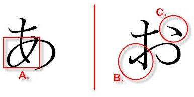
Similar Hiragana: あ (a) and お (o)
あ (a)、い (i)、う (u)、え (e)、お (o) are probably the first 5 hiragana you will attempt to memorize.
Be careful about あ and お, however as it’s easy to confuse them (it’s happened to me more than once).
The reason why it’s so easy to confuse them is that they both have a symbol that resembles a cross (in the middle). It pays to identify the differences In order to properly distinguish both hiraganas. Notice how both have a circular motion in their writing. This “circle” is located differently however. In あ, the circle is located on the cross (A.) while in お, the “circle” is located on the left side of the cross. Another major difference is that in お, you have this little mark on the right (C.) which is missing in あ. A good way to identify お rapidly is to be on the lookout for that little mark (C.)
Similar Hiragana: さ (sa) and ち (chi)
さ(sa) and ち(chi) are probably some of the most confusing hirgana. You’ll find yourself times and times again wondering which one is which.
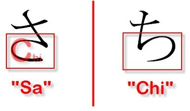
The main difference is essentially the bottom half. The “c” shaped stroke is facing different directions in both hiragana. In the picture above, it is as if a mirror had been put right in the middle.
“Chi” starts with the letter “c”, which is reminiscent of the bottom half of both hiraganas. Remember that the hiragana whose lower is most similar to a “C” is “Sa”. Picture this as a trap of some sort. This automatically implies that the other one is “Chi”. Take some time to really drive this one in as it is tempting to associate さ with “chi” because the bottom looks like a “c”.
Similar Hiragana: そ (so) and ろ (ro)
Thankfully, these two hirganas are easier to distinguish. Let’s look at the picture right below for a minute:
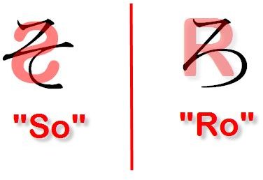
ろ, with some imagination, does look like a capital “R”. This makes this hiragana easier to remember as the hiragana looks like the first letter of its pronunciation. On the other hand, そ looks like an inverted “S”, which also makes it easier to differentiate both hiraganas, as they both look like the first letter of the way they are written in Romaji.
Similar Hiragana: まand も
Those two hiraganas are a bit more troublesome to differentiate - they are very similar.
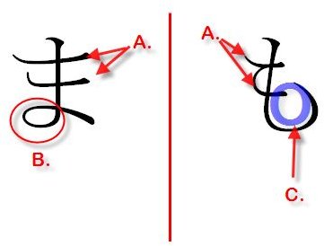
Notice how they both have two twin strokes on the main vertical line (A.). One difference is that the top horizontal stroke in ま is longer than the one right below it. In も the difference between the two horizontal strokes isn’t as pronounced.
Another major difference is that ま has this little circular motion (B.) on the left side which is missing in も. One last major difference is the upward curved stroke on the right side of も。Notice how that curve reminds us of the letter “o” as in “mo” (も).