The Serif Fairy: Explorations in the World of Letters for Grades Three to Five
Exploration in the World of Letters
One of the areas most overlooked by art educators and elementary educators interested in integrating the arts into their curriculum is graphic design and graphic design topics such as typography. This is not the fault of the educators themselves, as there are a dearth of materials and literature for children covering this ubiquitous yet fascinating topic. One delightful book that addresses this dearth is René Siegfried’s <em>The Serif Fairy – Explorations in the World of Letters</em>, a book that follows the adventures of the serif fairy, a little fairy that loses one of her magic wings and embarks on a journey to find it. (For readers unfamiliar with graphic design terminology, a “serif” is the little tab or “foot” that can be found at the tips and edges of letters in fonts such as Times and Times New Roman).
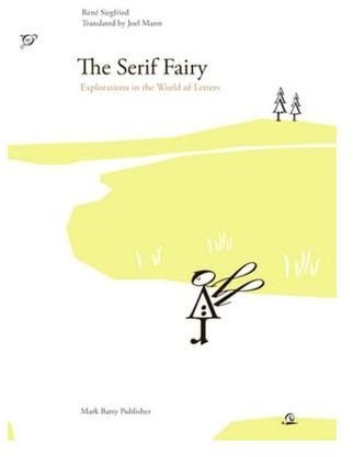
At the beginning of the story, our little protagonist discovers that she has lost her left-wing while chasing a butterfly and can no longer fly. Thus begins her adventurous search for her magic-inducing wing through a wonderfully designed typographic landscape. Her first destination is the Garamond Forest, populated by fir trees, a majestic stag, birds, and friendly snails. Unsuccessful in the Garamond Forest, she makes her way to the Zentenar Gate, located in a large, airy clearing and surrounded by great swarms of butterflies. Here she makes more friends, this time a happy, tail-wagging dog. Hoping to find her wing as well as meet a king, she ambles around the meadow and stops to admire a cluster of pungent mushrooms. The king and her wing, unfortunately, cannot be found around Zentenar Gate, so she soldiers on, this time to Futura City. Unaccustomed to urban surroundings, our fairy is confronted by utilitarian-looking skyscrapers, loud traffic, harried pedestrians, and the Office of Lost Property, where she inquires about her lost wing. Her wing is not in Futura City, so, undeterred, she makes her way to Lake Shelley in hopes of finding some green space along with her wing. Here she meets an uncommunicative frog, a water snake surprised to meet a fairy, and a crab who finally leads her to her long-lost wing.
The book’s biggest strength is its elegant, minimal (yet whimsical) illustrations that demonstrate the connection between the typeface’s “look” and the imagery it is meant to evoke. All of the objects and animals in the book are cleverly created entirely of punctuation and letters of the corresponding typeface’s alphabet, providing children with ample opportunity to identify the letters Siegfried uses to construct each of the book’s charming characters. Another strength of the book is Siegfried’s avoidance of cuteness or condescension toward his young readers, an unfortunate problem that can be found in so many children’s books. At times the narrative is overly wordy and ponderous, but this may be due to the translation from the original German.
In short, this book is a wonderful and unusual addition for any art or elementary teacher’s library; an excellent introduction to the world of graphic design and typography.